Project Overview
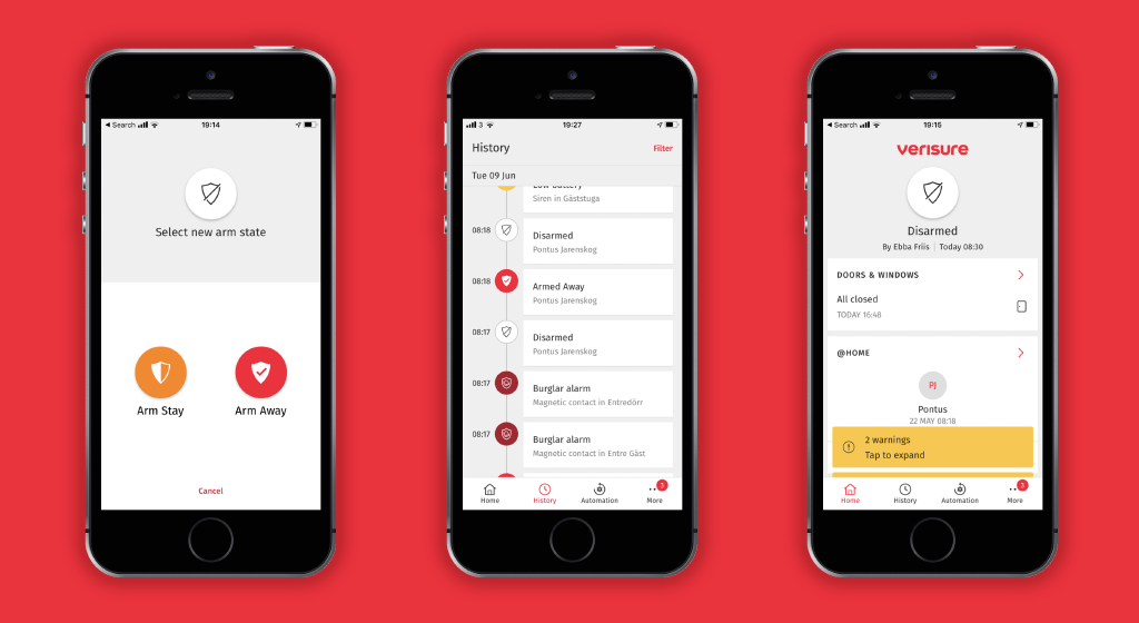
A new app web and a whole design system for Verisure, Europe’s leading home security company. This is one of many projects that I did with Verisure while working for Topp.
Year
2017
Client
Verisure
Role
UX-Lead
The Challenge
Topp had previously worked with Verisure, mostly with various product concepts. This time we were asked to propose, and design the next generation of the home alarm experience. The new experience needed to update the existing app (and web service) as well as cater for future products, services, and modalities. Adding to this challenge, in the past, Verisure offered different product portfolios to each of their markets; this next generation needed to unify the product portfolio in all the markets.

The Project
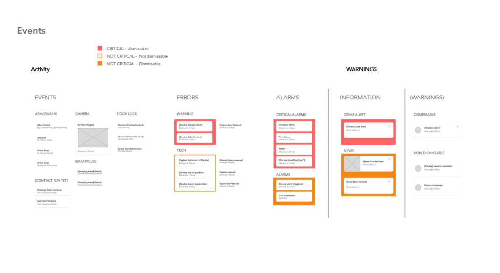
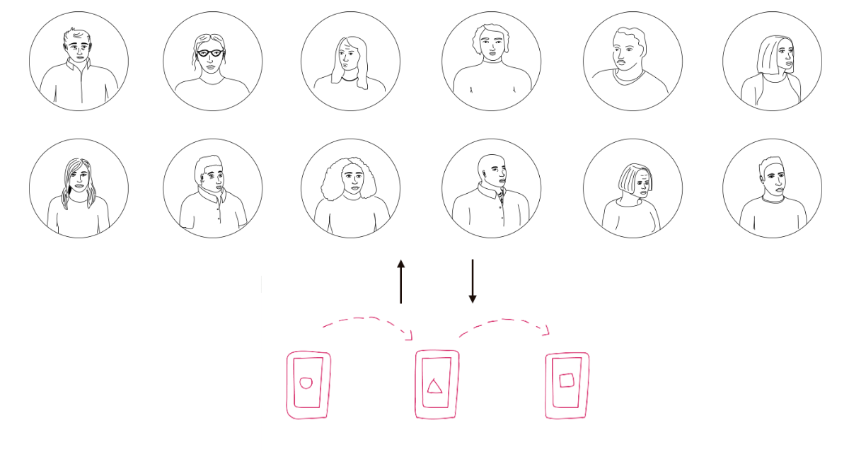
Verisure has lots of user data. However there had been little research specifically for design before. We did research in different regions which gave us an understanding of how the users actually perceive their alarm systems. One of my tasks was to translate these insights into concrete designs. We came up with a couple of different directions that were prototyped and tested with both stakeholders and users. Once the general direction was settled I was tasked to create flows and wireframes for the app, which was to be developed by the client’s own team. In parallel visual style was developed together with Verisure’s global brand. In the second part of the project, the research and app design laid the foundation for creating principles and a design system for more digital products.

The Result
The design system really helped activate Verisure’s own internal design team. The Verisure app is one of the highest-ranked utility apps in the app store with a +4 rating.